fanbox
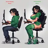
コントラストは低い方が馴染みやすくて良い気がしますが、どうなんでしょうか… I guess low contrast is better in terms of color brending,but I can’t tell which is truly right. PS : I found that it’s wrong for reality to paint with just one color.
Paolo Rivera, Comic Book Artist
OgSog
ヒガ
雨夜
bloodline
tuotuo
dumbsville
KoriDwagon
marrazan
Remarin
MG29号
Pokko
imamiii
croquant
brwncolors
dillongoo
観介
孫米
ai_tan
Nino Satori
PassChan
J0RR3L
Mirindraws
Vincent Rochefort Photography
tanya asmr
Void Sequence
Pasquale Buonomo
joerandel
horntfrog
Shio
Sevaztian21
Shade Tomlinson
arachnoid888
Zoey Moonblood
XP's site
dmex2
foolishfifteen
ambersquest
Halcybella
Janet Devlin
極太眉毛
nakeyjakey
ntrman
Doccah
orobou
orez04
EifieChan
ぶるーちぇりお
TheShadowmind
shindol